
Rebecca Holloway
Senior Social Media Strategist
Rebecca is an award winning Senior Social Media Strategist who specialises in paid social media campaigns.
When you create content, how often do you think about the colours you're using and how that might help or hinder you in your mission to connote the message you want.
I decided to start exploring the world of colour theory, and expand into colour psychology over the next few weeks. I want to learn about what different colours mean, how they can be used to tell a story, and how colour affects people, specifically in marketing.
Today I’m going to look at the basics of colour theory, and how to put colour schemes together.
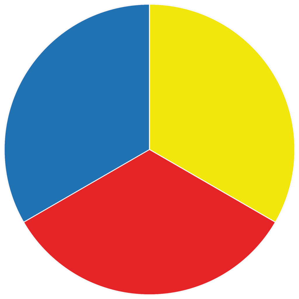
There are three primary colours, red, blue and yellow. These three colours can be mixed together to create secondary colours.
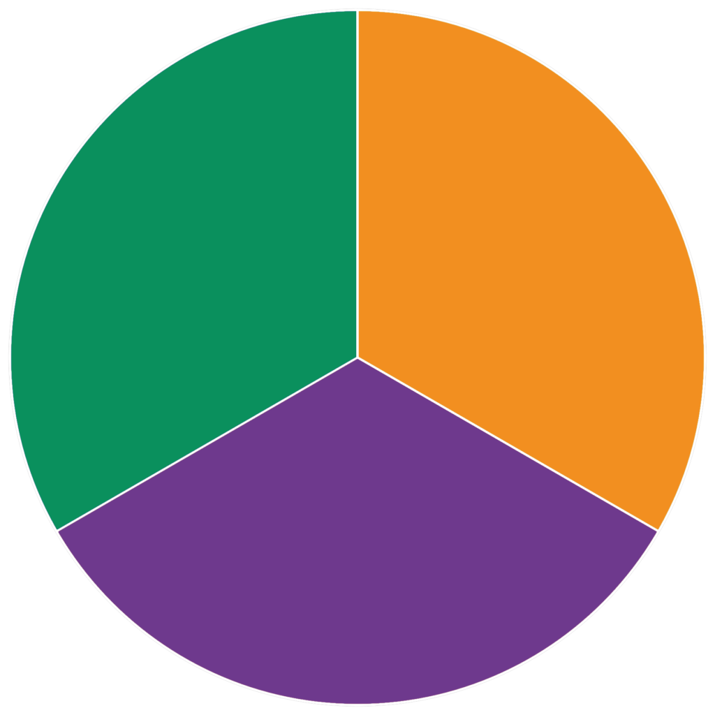
The three secondary colours are purple, green and orange. They appear between the primary colours on the colour wheel.
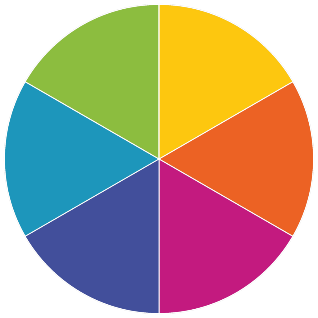
Tertiary colours are two name colours. These colours are made by adding together an equal amount of a primary colour and secondary colour. The colour made ends up being closer to the primary colour.
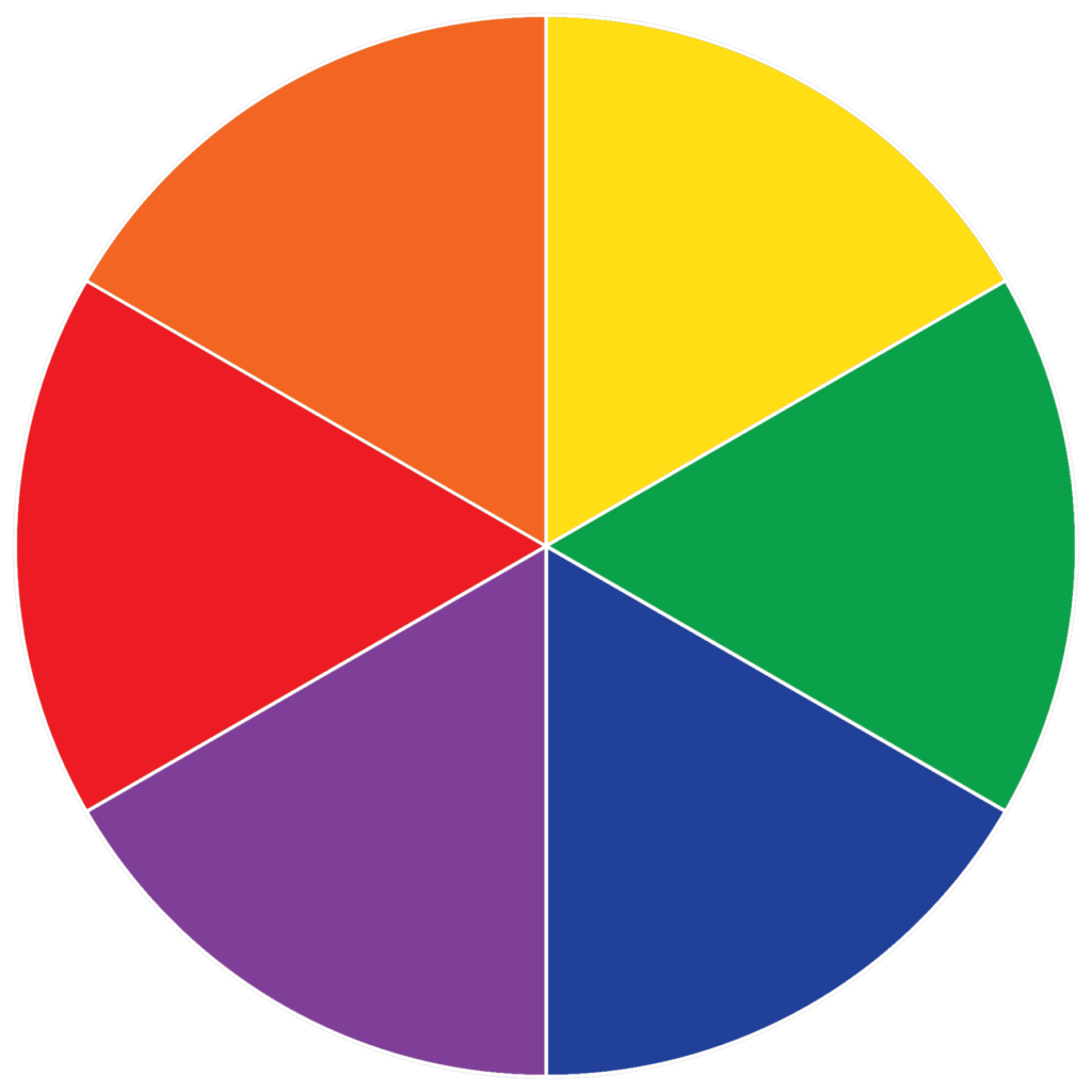
Pure colours (also known as saturated colours) are primary, secondary and tertiary colours which haven’t had any white, black, or a third colour added to them. These colours are very bright and intense.
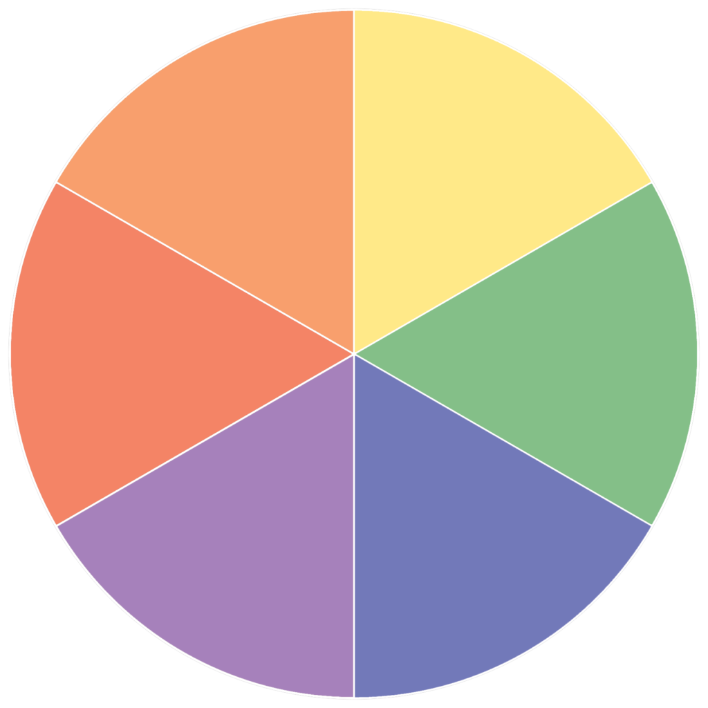
A tint is a colour that has had white added to it. These colours are sometimes called pastels, because they’re not as intense, and are much closer to white in colour.
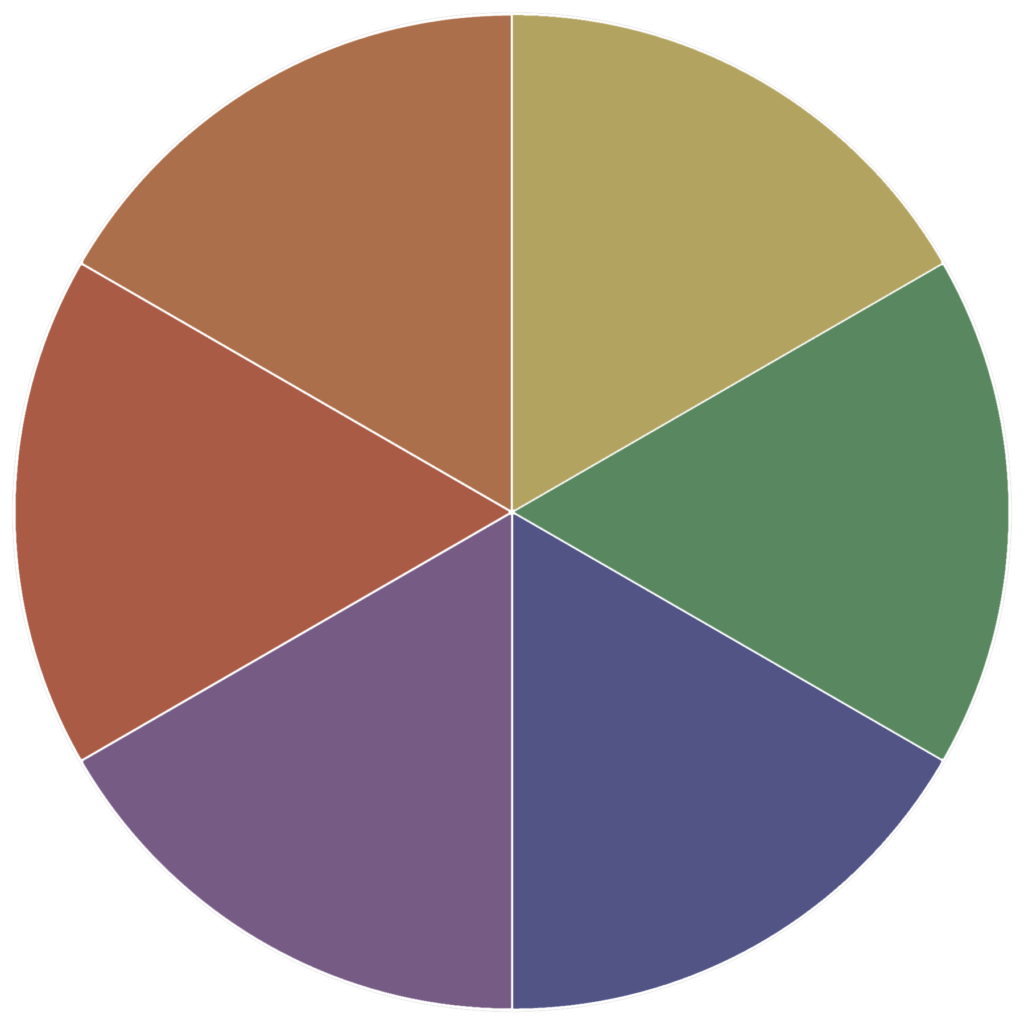
A shade is a colour that has had black added to it. These colours are much darker and dull than pure colours, and can range from a slightly darker shade to almost black.
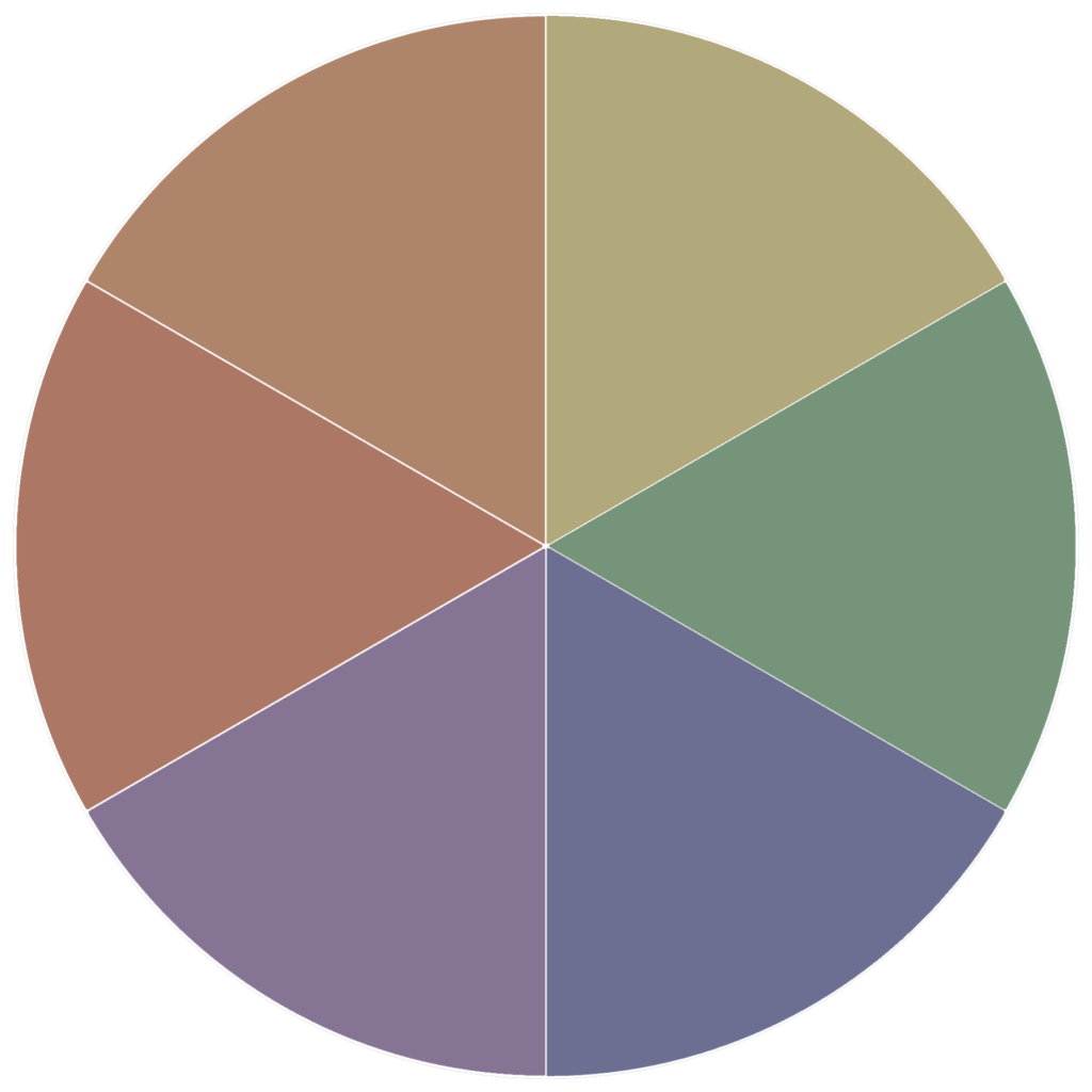
If you add grey (black and white) to a pure colour, you create a tone. You can do this to change the intensity of the colour.
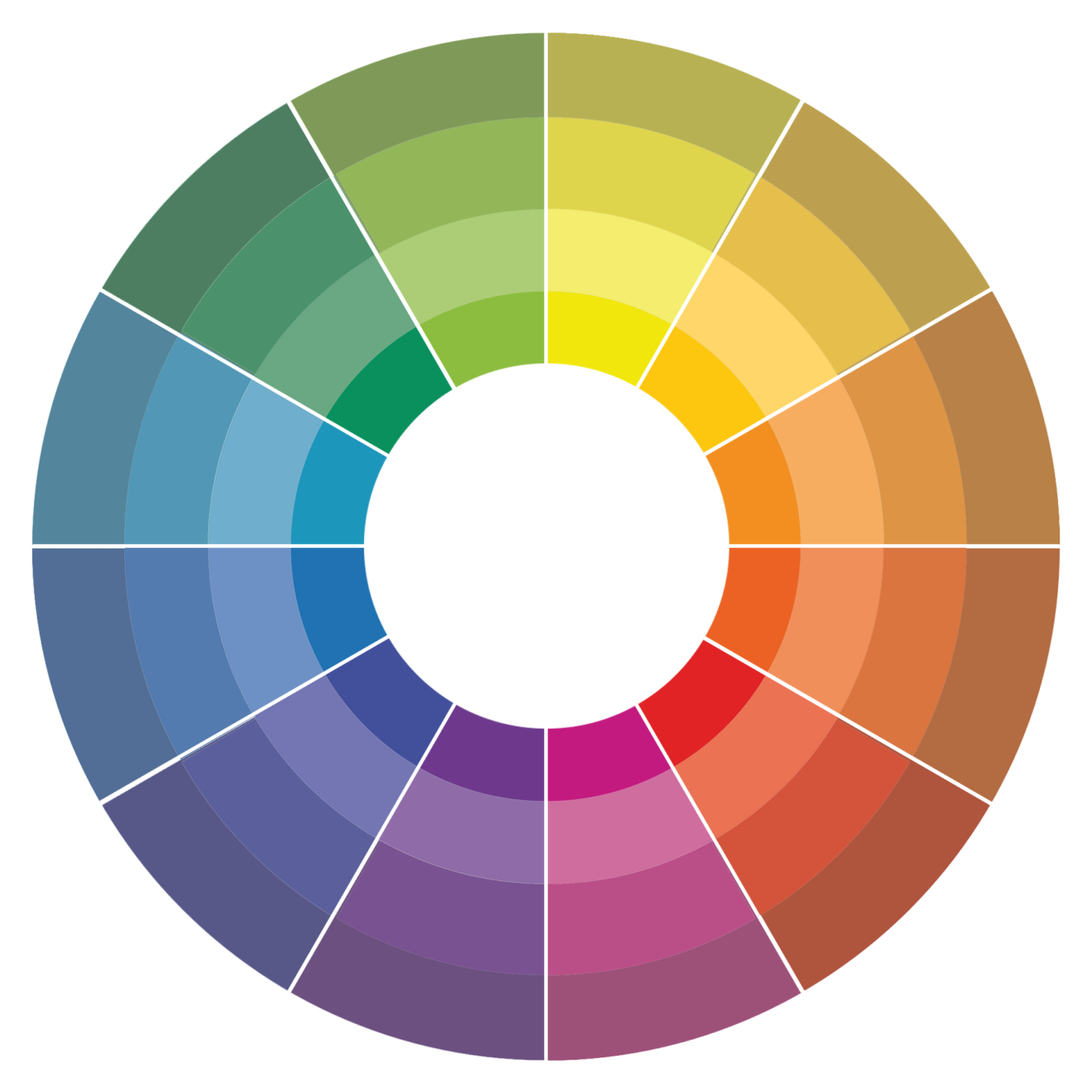
Here is the completed colour wheel. You can see here all the different colours, including primary, secondary, and tertiary, as well as tints, shades, and tones.
On the left side of the colour wheel, you have colours which connote the impression of calmness. They’re much more peaceful and serene colours.
On the right hand side of the colour wheel there are much warmer, more vivid colours. These are very bright, energetic colours.
Now you understand how the different colours are made, you need to know how to use different colours together when creating marketing/brand material. Let’s take a look at the different methods you can use to pick colours, this is called colour harmony.
It’s important to get colour harmony right so that you can create a balanced visual experience for the user. If you get the colour harmony right, you will be able to engage the viewer, your work will have a sense of order, and it will be pleasing to the eye. People will notice your marketing material. Having good colour harmony is the first step in getting your audience’s attention, for all the right reasons. Below I will explain different colour schemes you can use to achieve colour harmony.
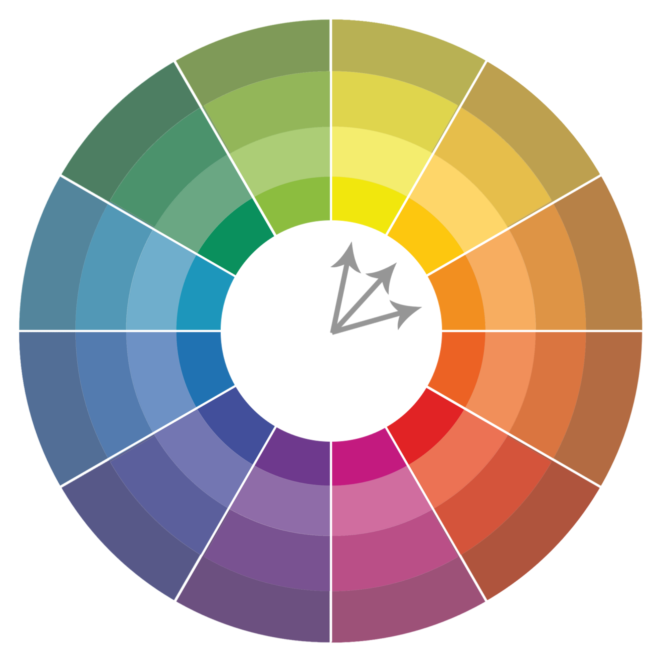
An analogue colour scheme is any three colours which are side by side on a colour wheel with 12 segments.
The analogue colour scheme will help you pick colours which are harmonious and pleasing to the eye. You can use analogue colour schemes to help instruct a user where to take action. Think of the colours as a call to action in themselves.
You will quite often find that an analogue colour scheme is used in nature.
When using an analogue colour scheme, you should aim to have one dominant colour, one supporting colour, and the third can be used for accents.
E.g. Yellow-green, yellow, and yellow-orange
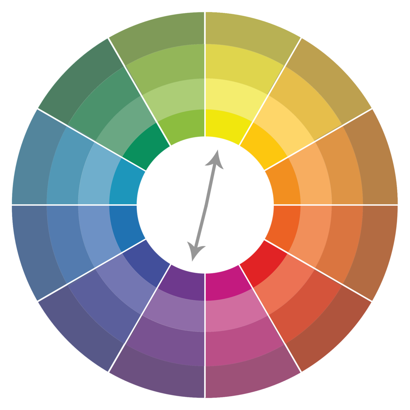
A complementary colour scheme is made up of two colours which are directly opposite each other on the colour wheel.
You can use this colour scheme to create a very vibrant look, with high contrast. You have to be careful though, as too much of this can become tiresome for the viewer. It can make imagery stand out, but it’s not recommended for text.
E.g. Red and green

A triadic colour scheme uses colours that are evenly spaced around the colour wheel. This combination of colours tends to produce a very vibrant, bright colour scheme.
Be careful if you use this colour scheme, let one colour dominate the other two accent colours. This can be a great way of achieving colour harmony, whilst ensuring elements stand out.
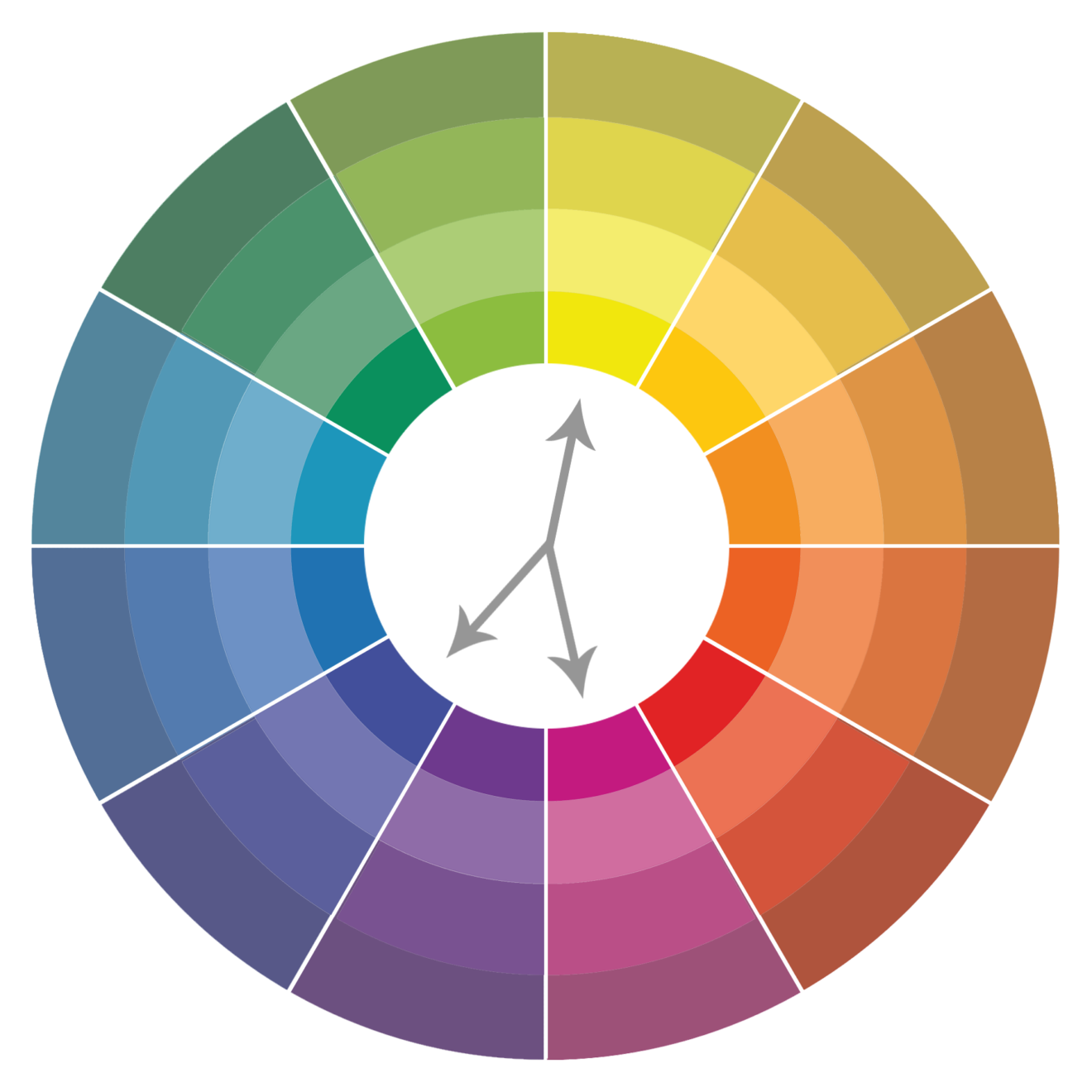
This colour scheme is a variation of the complementary colour scheme. It takes a base colour, and two colours either side to complement the base.
It’s great for creating a strong visual contrast, but with less tension than the complementary colour scheme.
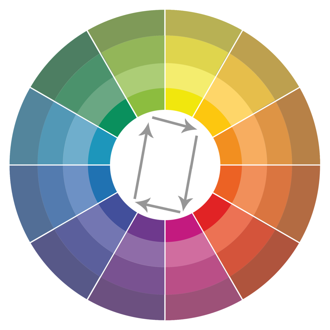
The rectangle colour scheme is made up of four colours connected in a rectangular shape. Think of it like grouping two complementary pairs.
When using this colour scheme, you have plenty of opportunities for variation, but you should ensure you try and let one colour be dominant. Remember to pay attention to warm and cool colours when creating your branding and marketing material.

The final colour scheme I will be looking at today, is the square colour scheme. It’s very similar to the rectangle colour scheme, but all four colours are evenly spaced around the colour wheel.
Just like the rectangle colour scheme, you should let one colour be dominant if you want the best outcome. Now you know the basics of colour theory, you can begin to choose colours and know how to put them together. Colour theory is vital when it comes to putting together colours for new logos, your brand, and any promotional content you might be making.
If you understand colour theory, you can use this to your advantage and work out what your competitors are trying to say. You can control how your audience is going to interpret your content.

Senior Social Media Strategist
Rebecca is an award winning Senior Social Media Strategist who specialises in paid social media campaigns.
View my other articles and opinion pieces below
Understanding multi-market paid strategies is crucial to the success of any social media marketing campaign. I recently had the opportunity to speak at the International Social Summit in Barcelona, collating experiences from the past year to share some advice for organisations planning their own paid campaigns across multiple regions. The Problem Running a multi-market campaign […]

Think of an advert. Any advert. What came to mind? Maybe it was the Go Compare singer, policemen with kids’ voices eating Haribo sweets, or the Old Spice man. Maybe, from some deep groove in your brain, a single phrase rang out, as easy to remember as your mother’s name or your earliest childhood memory: […]

When it comes to B2B social media marketing, few platforms are more misunderstood than TikTok. These misconceptions can lead to one of the most exciting platforms in social media marketing being written off by B2Bs – and huge opportunities missed. If you don’t take TikTok seriously enough, you will miss out to the businesses that […]

What’s the point? I think about that question all the time. No, I’m not having an existential crisis. I think about it because it’s the first question on the minds of many of our clients and prospects when considering their social media marketing activity. Why is social media important for businesses? What’s the value of […]
